As of the time of publishing, WCAG 2.2 hasn’t officially been released yet, but the drafted success criteria have been published. Atop of the existing 50 combined criteria from 2.0 and 2.1, WCAG 2.2 provides eight new success criteria.
NOTE: On the go? Get the complete WCAG 2.2 AA guidelines to take with you by downloading C2’s Web Accessibility Checklists for Code, Content, and Usability.
How are these guidelines categorized?
WCAG 2.2 guidelines are categorized into three different conformance levels (Level A, Level AA, and Level AAA) based on the impact they have on design or visual presentation of the pages in order to meet the needs of different individuals and different situations. Conformance levels must be met in full and conformance at higher levels indicates conformance at lower levels:
- Level A – The lowest and easiest level of conformance to obtain. Level A sets a minimum level of accessibility and does not achieve broad accessibility for many situations.
- Level AA – The mid-range and most common level of conformance to obtain. Level AA is the recommended conformance for all web-based information.
- Level AAA – The highest and hardest level of conformance to obtain. It’s not recommended to strive for full AAA compliance as it is not possible to satisfy all Level AAA Success Criteria for some content.
Who do these guidelines support?
- Low vision users – WCAG 2.2 extends requirements for graphics and introduces new guidelines to enhance focus of on-screen elements to support better visual perception and keyboard operability.
- Users with cognitive, language, or learning disabilities – WCAG 2.2 includes requirements to provide additional information about the specific purpose of input controls and additional requirements to support stronger navigation of a website, including the ability to re-use information and simplify logging into websites.
- All users – realistically, WCAG 2.2 guidelines are all best practices to enhance usability and accessibility for all users.
How are these guidelines organized?
WCAG sorts their guidelines into the following categories: perceivable, operable, understandable, and robust.
Perceivable: All users must be able to perceive your content. If there is audio or video content, you should provide text alternatives. If there is text content, you should provide audio alternatives or a way that assistive technology such as screen readers can consume it for the end-user.
Ask yourself: Is there anything on my site that a deaf, colorblind, low vision or blind user would not be able to perceive?
Operable: All users must be able to operate your site. Most users with disabilities use a keyboard to surf the web using character key shortcuts along the way to navigate, interact with, and access content. Your site should be forgiving to your users if they make a mistake, offering ways to retract, correct, and confirm information.
Ask yourself: Can my site be navigated and operated solely through a keyboard? Do users have control of interactive elements on my site? Are tasks on my site able to be easily and successfully completed?
Understandable: Just because your users can perceive and operate your site doesn’t necessarily mean that they can understand it. Interactive elements on a site including menus, icons, and links should all give an insight to their destination.
Ask yourself: Are all my site’s interactions easy to understand? Is the content on my site presented clearly and meaningfully?
Robust: Users should be able to access your site from any device, platform, or browser. Adopt best development practices to support different operating systems and browsers. To guarantee a functional site for a diverse set of audiences, avoid any mishaps and ensure that your code is clean.
Ask yourself: Is our site developed with best practices in mind? Can our site or application support a variety of devices and browsers? Is the code to our site clean?
New WCAG 2.2 Operable Criteria
2.4.11 Focus Appearance (Minimum) (Level AA)
The intent of WCAG standard 2.4.11 is to help low-vision users who use a keyboard to navigate a site by ensuring the current point of focus is clearly visible. While closely related to WCAG standard 2.4.7, which does not specify what form the keyboard focus must take, this criterion sets a requirement that the minimum size of the focus indicator must be at least 1-pixel thick border around the element.
Examples to pass this criterion include designing a thick border around the element or significantly changing the background color.

2.4.12 Focus Appearance (Enhanced) (Level AAA)
The intent of WCAG standard 2.4.12 is to help low-vision users who use a keyboard to navigate a website by ensuring the current point of focus is highly visible. This criterion takes newly introduced WCAG standard 2.4.11 to the next level by providing a higher level of visibility. The minimum size of the focus indicator must be at least 2 pixels thick around the element.
2.4.13 Fixed Reference Points (Level A)
The intent of WCAG standard 2.4.13 is to help users with disabilities find references to content based on the page locators found in both the printed version and digital version of a publication. This is to ensure that all users can literally be on the same page.
Examples to pass this criterion is the include navigation to page number references within a digital publication that match the paper version of the publication.
2.5.7 Dragging (Level AA)
The intent of WCAG standard 2.5.7 is to help users who have limited motor ability and struggle with performing path-based gestures (e.g. sliders, drag-and-drop interfaces) by providing a single pointer mode of operation. While WCAG standard 2.5.1 requires dragging features to be accessible, some interfaces that work with dragging and keyboard controls do not work using only clicks or taps.
Examples to pass these criteria include enabling the keyboard to work with up/down/left/right arrows or providing buttons onscreen with up/down/left/right buttons to move the view as well, such as a map, sortable list, or columns in a Kanban view.
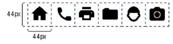
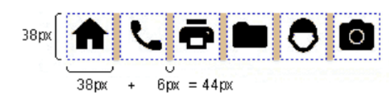
2.5.8 Pointer Target Spacing (Level AA)
The intent of WCAG standard 2.5.8 is to help users with hand tremors and difficulty with fine motor movement be able to properly click on intended elements, such as buttons. Providing spacing between targets will reduce the likelihood of accidentally activating the wrong control.
Examples to pass this criterion include providing a target size of at least 44 x 44 CSS pixels or leaving proper spacing between targets to equal the sum from one target to the next of 44 pixels.
New WCAG 2.2 Understandable Criteria
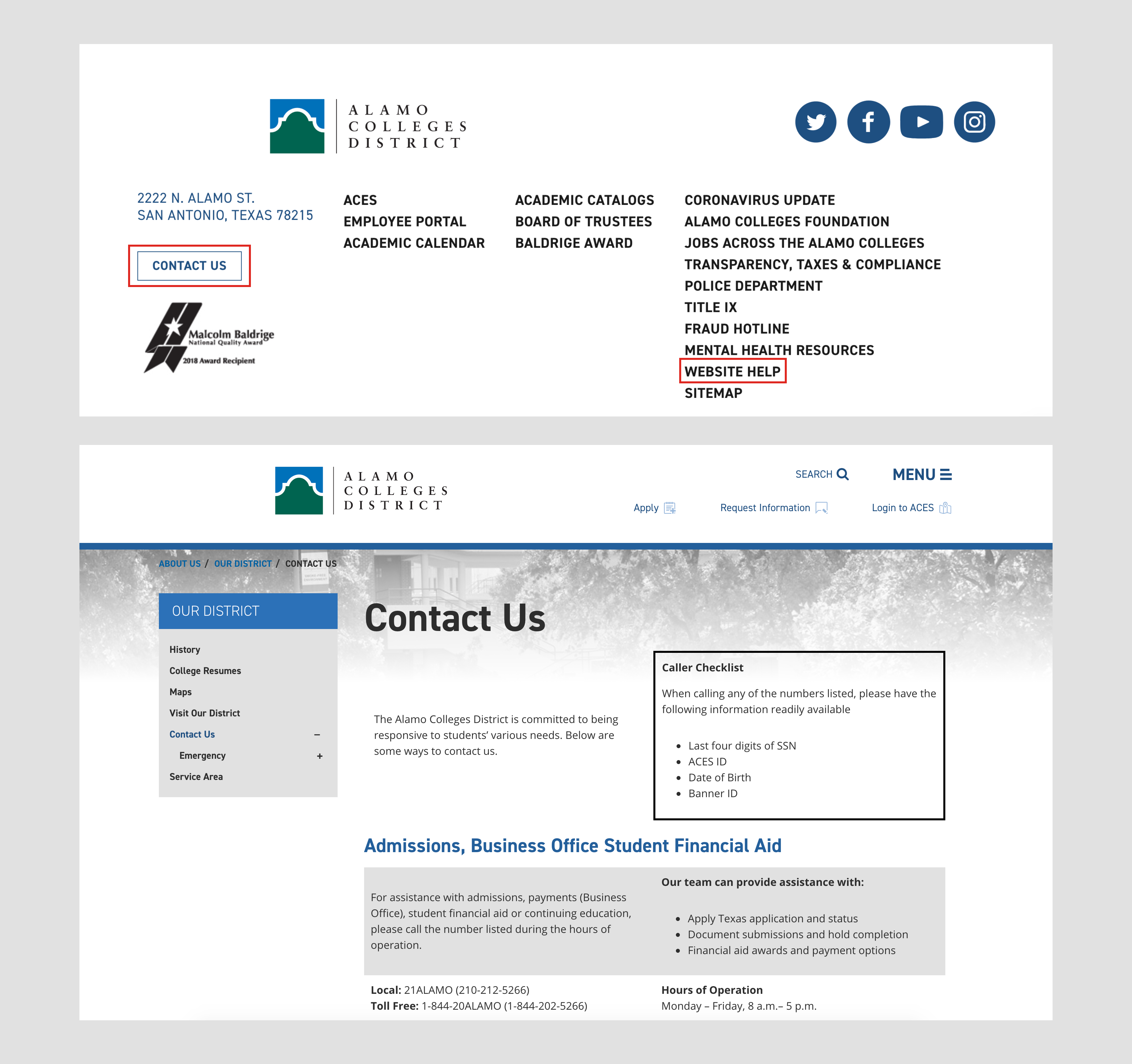
3.2.6 Findable Help (Level A)
The intent of WCAG standard 3.2.6 is to ensure users can find help for completing tasks on a website. This is distinctly different from interface-level help, such as contextual help (tooltips), features like spell checkers, and instruction alt text in forms. This requirement applies to single page applications (SPAs), and any set of web pages with blocks of content that are repeated on multiple web pages.
Examples to pass this criterion include providing human contact details such as a phone number or email address, direct link to a fact and question page or built-in messaging option like a client chat.
3.2.7 Hidden Controls (Level AA)
The intent of WCAG standard 3.2.7 is to help users with cognitive issues quickly find controls needed to progress or complete a process easily. Rather than requiring user interaction, such as moving the mouse or hovering over an element, controls should be displayed at all times.
Examples to pass this criterion include providing persistently visible controls such as when writing an email, controls needed to trash or forward the email should be visually persistent without having to hover around the editor.

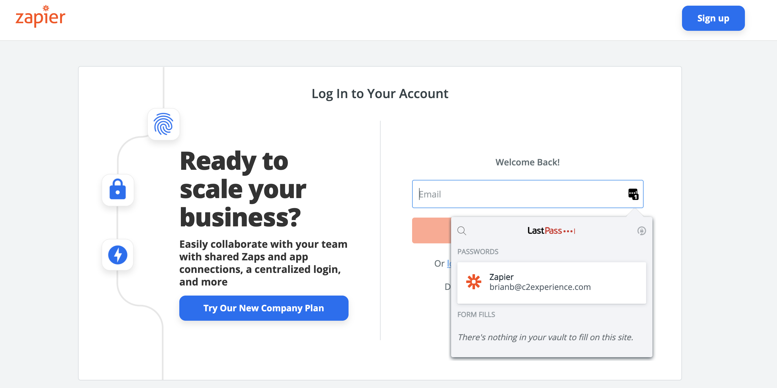
3.3.7 Accessible Authentication (Level A)
The intent of WCAG standard 3.3.7 is to help users with cognitive issues have an easy-to-use, accessible, and secure method to log in and access content. There should be a path through authentication that does not rely on cognitive function test, such as memorizing a username and password or ReCAPTCHA identifying images of a particular object. If there is more than one step in the authentication process, such as multi-factor, all steps must comply.
Examples to pass this criterion include the ability to copy and paste from password managers or device authentication. Field inputs should not be blocked to allow for the user’s browser or extension to identify and fill in the username and password.
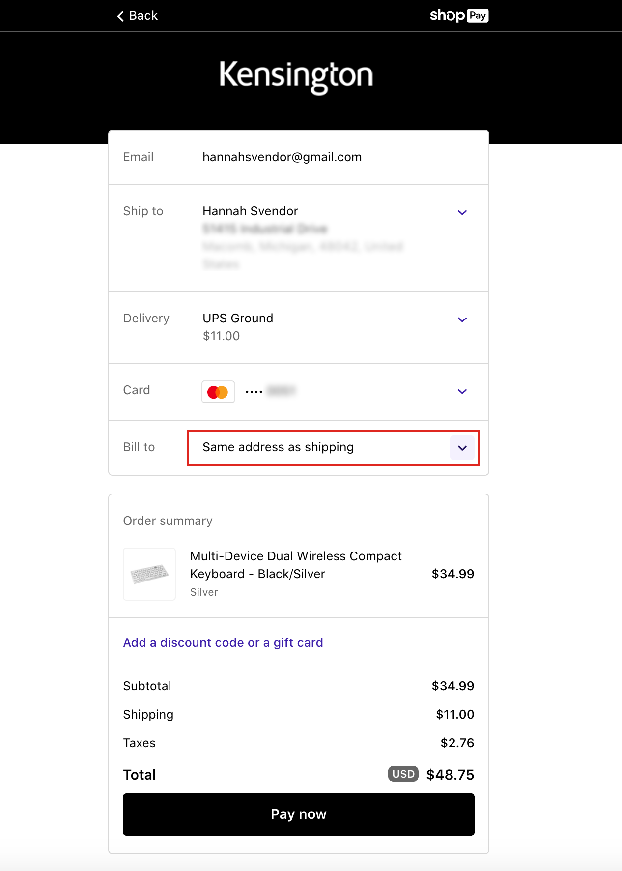
3.3.8 Redundant Entry (Level A)
The intent of WCAG standard 3.3.8 is to help users with short-term, memory difficulty, and other cognitive issues limit the need to recall information provided in a previous step of a process, such as a form submission.
Examples to pass this criterion include allowing the user to confirm that the billing address and shipping address are the same address.
Wrapping up
I hope you found these WCAG 2.1 guideline explanations to be helpful as you work towards implementing best practices for enhanced accessibility. Remember, WCAG is a set of standards meant to enhance user experiences and support individuals of all abilities and disabilities.